 Product demo.
  What is data observability?
  What is a data mesh--and how not to mesh it up
 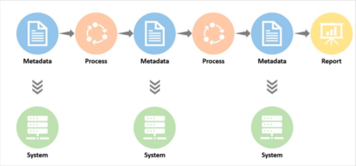 The ULTIMATE Guide To Data Lineage
 The Data ROI Pyramid: A Method for Measuring & Maximizing Your Data Team

Barr Moses
CEO and Co-founder, Monte Carlo. Proponent of data reliability and action movies.

Michael Segner
Michael writes about data engineering, data quality, and data teams.
As recently as a year ago, about half of the data leaders we spoke with felt the business value of their team sold itself. Today, maximizing and measuring data team ROI is near the top of every data leader’s agenda.
Most data team ROI formulas focus on some version of the following calculation:
Lift / investment = ROI.
And while there’s certainly value in its simplicity, it doesn’t capture the full value of the data team. For example, how do you capture the value of:
- A customer churn dashboard
- A dataset that supports ad hoc queries of engagement behaviors
- A migration to a new data stack that supports faster, more scalable compute
- Increasing data adoption by 30% as a result of a data quality initiative
It’s not easy! Grizzled data industry veterans who have successfully turned the wild world of customer acquisition funnels into a predictable science start squirming when looking inward.
Over the last six months, we’ve spoken with data leaders and iterated on a variety of ROI formulas, all in an attempt to reach a point that, if not capturing the exact value of a data team, can get us a little closer.
And the result of those conversations has been none other than a brand new data ROI pyramid. Yes, I’m aware of all the great pyramids and conjoined triangles that have come before… but this one is different. Sort of.
The goal of this pyramid is aimed squarely at helping data leaders
- Get closer to the business
- Balance competing priorities
- And focus on the right metrics to generate value for their stakeholders.
So, with the preamble out of the way, let’s take it from the top!
Table of Contents
Calculating data ROI
As a general rule of thumb, the higher your report in an organization, the fewer and more encompassing your metrics will become. The CEO doesn’t care how many dashboards you support or your data freshness SLA adherence percentage.
They want to know what their investors want to know, “am I getting a return on my investment?”
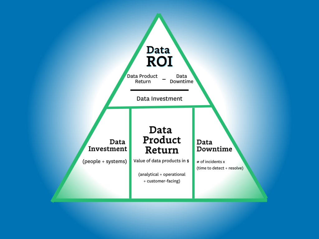
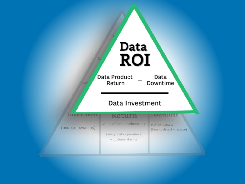
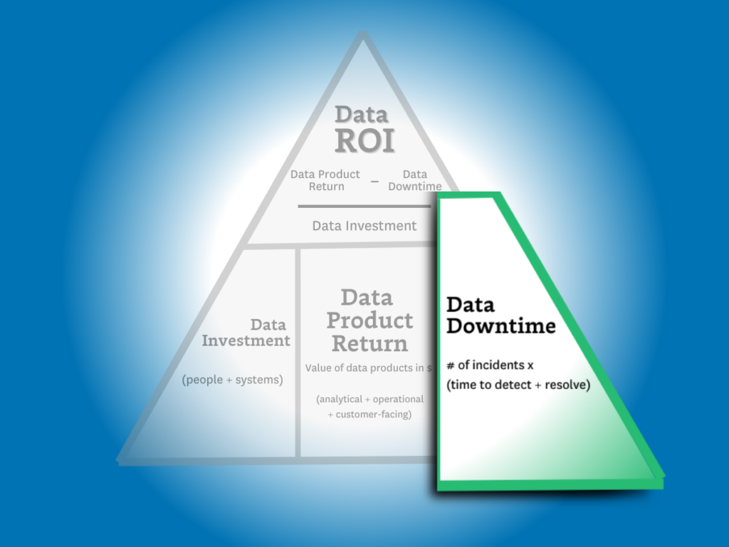
The data ROI pyramid tackles this question with a similar formula to the one in the introduction:
(Data product value – data downtime) / data investment = ROI
…but there are two key differences. The first is the more expansive definition of “data product value” (more on that later) and the second is the introduction of data downtime.
The downtime variable is important to include because as more data teams drive higher levels of revenue–via machine learning models, customer-facing apps, data democratization, and other initiatives–the more severe the consequences of downtime becomes in terms of lost time, revenue, and trust.
This also makes reducing data downtime one of the three key strategies for data leaders to increase ROI: you can either increase revenue, you can decrease your investments, or you can reduce your data downtime. And one of those fruits hangs a lot lower than the others.
So, now that we have a framework for calculating ROI, let’s dive deeper into how we identify the variables.
Calculating data investments
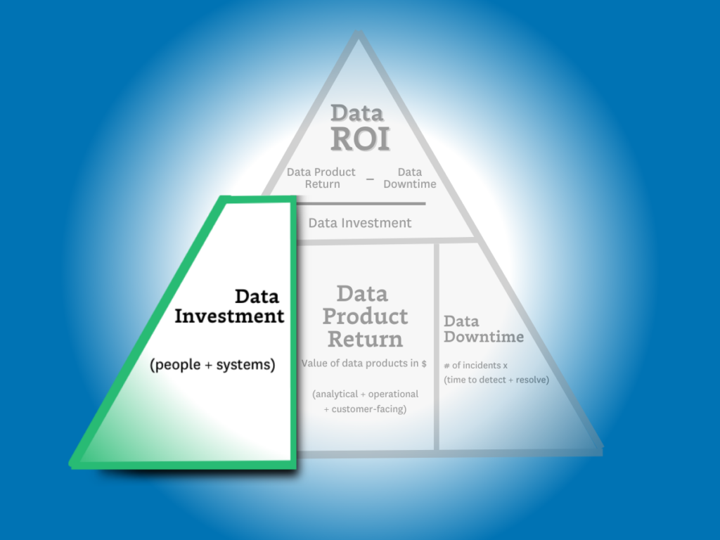
The formula is easy — investment = people + solutions.
But it’s also easy to overcomplicate.
Some contracts are annual. Others are not. Some solutions charge based on usage. Others don’t. My recommendation here is to keep this component relatively simple. Stick to an aggregate projection of costs divided evenly across a time period (typically a month or quarter).
Levers to optimize data investments
When it comes to optimizing your data investments, the name of the game is efficiency. To get the most out of your data investments, you need to improve the speed at which those investments deliver value.
Below are three levers you can pull to improve efficiency for your data systems, your data teams, and your data consumers.
- System optimization — The cost of almost all modern data solutions is based on usage. The metrics you will want to keep an eye on here are the total number of items that drive these costs (tables, queries, VMs, warehouses, etc) and the outliers at the top (expensive queries) or the bottom (unused tables). A few ways to understand and control data system costs could be through assigning ownership for domains, cleaning up unused assets and costly queries, or even consolidating your data stack around central tooling.
- Time to build and maintain — The time it takes to build and maintain your key data assets, including data products and machine learning capabilities, is a key lever that measures your data team’s productivity. While larger upfront investments may be required to develop an effective data platform to produce, simplifying the workflows for building and maintaining data pipelines can have a dramatic impact on data team efficiency.
- Time to insight (or action) — This lever is focused on the time it takes your data consumers to realize value. In other words, how effectively has the data team enabled your data consumers? Discoverability and self-service can both work to improve time-to-insight for consumers, while micro-batch infrastructures can make that data available at the lowest possible latency for machine learning, analytics, and reporting.
Calculating data product return
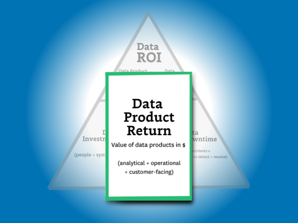
Calculating data product return is by far the most complex step in our ROI calculation. That’s because as the data industry continues to advance, the variety and complexity of data product use cases has continued advancing right along with it.
Fortunately, data products can generally be split into one of three primary categories: analytical data products, operational data products, and customer-facing data products. These can exist in the form of dashboards, ML models, experiments leveraging data insights, and—of course—generative AI. While the latter may be a bit more complex to build, genAI is still a data product at its core and its value can still be calculated using the methodologies we’ll outline below.
To really answer this question, the formula for data product return needs to be inclusive of all data team activities, whether they produce value directly (for example revenue generated via a paywall ML model) or indirectly (for example a customer churn dashboard).
The formula I would propose for calculating data product return is this:
Value from Analytical Data Products + Operational Data Products + Customer Facing Data Products = Data Product Return
As you can see, this part of the equation presents the most variables for our ROI calculation. Since this part of the equation is by far the most complicated, we’ll be spending the majority of our time here. So, with that in mind, let’s take a look at each subcategory (or use case) in a bit more detail.
Analytical Data Products
First, let’s dig into the value of the most traditional — and common — data use case: analytics.
Analytical data products are a mix of the critical dashboards, ML models, and experiments conducted and supported by your data team to deliver insights for decision making.
Whether we’re talking about the marketing dashboards or important metrics like customer LTV, analytical data products play a fundamental role in the day-to-day operations of any business. But in the same way that all data products aren’t created equal, the way you’ll calculate their value isn’t either. And, of course, some will be easier to calculate than others.
First, let’s look at experiments:
Measuring incremental impact
Measuring absolute impact is one of the simplest ways to understand return from any data product. And calculating the value of an experiment conducted as a result of your data team’s research and analytical insights can be quickly estimated by understanding the delta between test versus control and translating those numbers into dollars earned/saved each month.
For a more conservative approach, you could estimate value by computing the return against a random or average decision to better represent decisions made without support from your data team.
Combining tens or hundreds of these experiments per year will give you a ballpark figure for the incremental value delivered by the experimentation platform and the analytical work surrounding those experiments.
Measuring value-to-stakeholders
But what about dashboards? Rarely are these initiatives so easily measured by a controlled or natural experiment.
To account for these data products, we’ll need to take a more nuanced approach to estimating value. In this case, we’ll be translating qualitative data into something representative by tapping into the consumers themselves.
Believe it or not, your business users and data consumers are actually quite knowledgeable about how valuable your dashboard is (or isn’t) to them. And their responses can be quantified. While this may not seem rigorous enough at first glance, this is actually similar to the process MIT economists used to determine how free services contribute value to the national GDP. For example, they asked respondents how much they would have to be paid not to use Facebook or Google Maps for a year. ($40 to $50 a month for Facebook if you are curious).
For the most important dashboards, data teams can go a step further by creating a benchmark for respondents, like “We estimate the cost of maintaining this dashboard to be about $5,000 last quarter. In your estimation did it add that level of value to your work over that period of time?” For a baseline, here is how our survey of 200 data professionals revealed they judged their data consumers would value their dashboards:
- Less than $500k: 5%
- 500k-1m: 11%
- 1m-10m: 49%
- 10m-25m: 32%
- 25m+: 5%
Customer Facing Lift
Here I’m referring specifically to data that’s customer facing, not the ML models powered by data. This data use case generally comes in two flavors.
The first is when data IS the product. There are a significant number of businesses that ingest, transform, and then sell data to other companies. It could be a data mining company compiling insights from web scraping ecommerce sites or a television manufacturer that sells viewership data to advertisers.
In this case, calculating is pretty straightforward: the revenue of the data product is the revenue of the sale. When you find ways to enrich this data, you make it more valuable and thus increase the sale price.
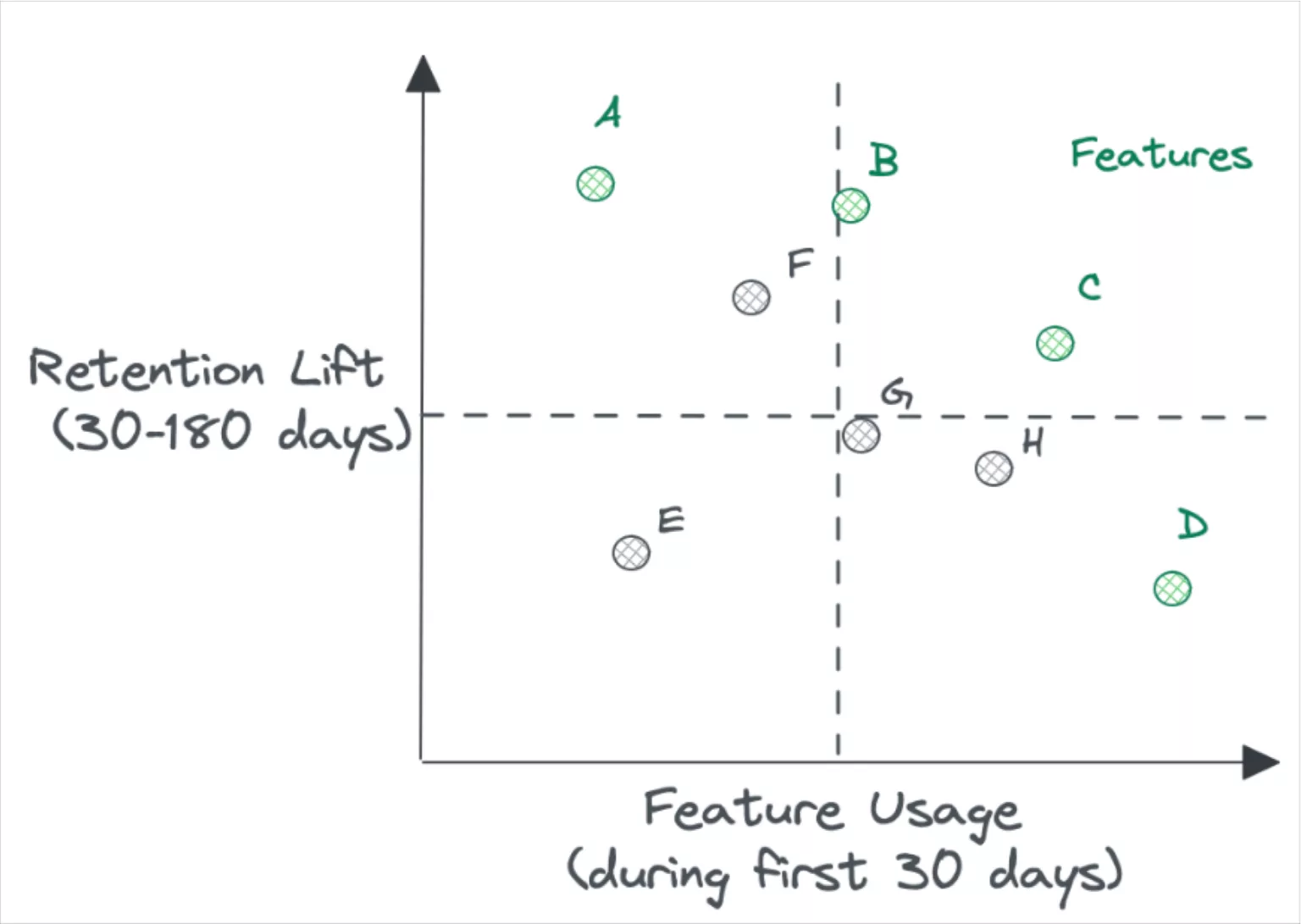
However, what about cases where data is only part of the product being offered? For example, a point of sale system providing insights back to the merchant on their foot traffic patterns? Or a video player that breaks down views across audience segments by time?
In some cases, the data will be a nice to have. In other cases, it will be a significant factor on customer acquisition and retention. Luckily, data teams have been experimenting and measuring the impact of features on retention for a while now.
Operational Lift
I define operational data use cases as activities that MUST take place. Examples would include reporting to the board or an airline re-accommodating passengers of a delayed flight.
If the data systems went down, these activities would still happen, but they would be considerably more painful. An organization may have to manually collect and aggregate data from across the business for its report or passengers may need to go to the customer service desk rather than have an app automatically present their options for re-accommodation.
In these cases the value is typically best determined by the hours saved between the more automated and more painful process. In some situations, alternative impacts such as fine avoidance or poor customer satisfaction could be calculated as well.
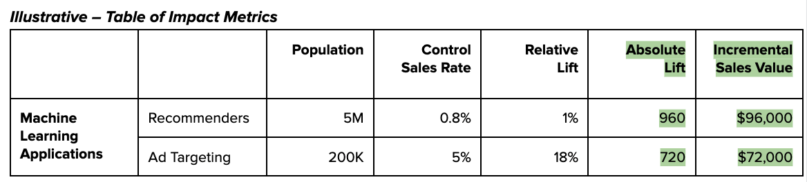
The lift of machine learning applications is an important component of this. These applications often support the user experience (e.g. recommenders, ad targeting) and directly drive revenue. It’s worth noting that precision is not the objective here – you should be aiming to get an understanding of the approximate model lift, and how that translates into dollars made or saved each month. The order of magnitude of this number is likely to tell you whether it’s worth continued investment.
Levers to maximize data product return
You can optimize data product value by increasing how effective it is and the range of its impact. Some broad proxies to measure this across a wide range of use cases and industries are adoption, reach, and velocity.
- Adoption and Reach — The more use a data product sees, the more value it can ostensibly provide. So driving improved reach and adoption can also dramatically increase the incremental value your data products will provide.
- Velocity — One of the biggest drivers of experimentation value is velocity: how many meaningful experiments can the organization execute over a period of time? More velocity can mean improved productivity, a more mature central platform, and even improved enablement for data consumers.
Calculating data downtime
Finally, we need to understand how data downtime impacts ROI.
In other articles, we’ve discussed how to calculate data downtime using your incident and response times. Here’s what that formula looks like:
Number of incidents x (average time to detection + average time to resolution)
This is helpful in measuring how your overall data product reliability is trending. But in this case, we aren’t as interested in the aggregate data downtime or the efficiency of the team (yet).
What we want to find out here is the operational cost for the data downtime of specific data products. To do this, you’ll need data lineage in order to understand the impact a data issue on an upstream table has across various downstream data products.
Since we’ve already calculated the revenue generated from each of our data products, including key dashboards, we can now subtract the operational cost of that downtime from the revenue.
For this component of the ROI calculation, I recommend only focusing on downtime that violates your data SLAs. If a dashboard that’s checked daily has a data freshness issue that only persists for a few hours before being resolved, that downtime is unlikely to have an operational impact on the organization (and your data team shouldn’t be penalized for it).
Levers to minimize data downtime
Improvements in data downtime can have a dramatic impact on your data team’s ROI calculation, especially for use cases where the data is so central to the product offering that data downtime is equivalent to operational downtime.
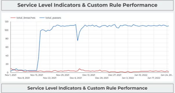
Red Ventures custom built SLA adherence dashboard.
We’ve covered the metric the CEO cares about and the strategic metrics data leaders should consider. Now let’s talk about the tactical levers your team can pull to maximize your outcomes across these strategic metrics.
SLA Adherence
SLA adherence, the amount of time the SLA has been breached divided by the amount of time it has been upheld, can help data teams maintain a granular understanding of how many data quality incidents are having an adverse impact on specific data assets—and what measures to take top protect the value of those products.
Coverage%
Minimizing data downtime can often be directly correlated to how well your data products are covered with monitors and custom tests from raw ingestion to final resulting table.Data pipelines and systems are radically interdependent. Higher coverage percentage typically will translate into better time to detection and resolution.
Status Update%
The teams that are the best at documenting their incident history are almost always the ones with the lowest downtime. High status update percentages encourage a lower time to resolution and can even help prevent incidents by providing better insight into overall data health.
If your data team has a low status update percentage it is either because of alert fatigue or because your team is unable to quickly triage incidents.
Calculating Data ROI Is Hard—But It’s Worth It
While I am under no illusions that calculating the ROI of a data product is either an exact science or a quick win, I will ardently uphold that it’s a worthwhile endeavor—and perhaps most importantly, an achievable destination.
I am also confident there are few activities more existentially critical for data leaders.
By better quantifying and optimizing the data team’s value, we can better earn our colleagues trust and recognition of the value we add to the business. At that point, the sky’s the limit for motivated, well-led data teams.
Our promise: we will show you the product.
Read more posts.