 Product demo.
 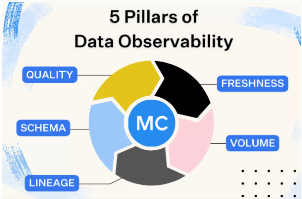 What is data observability?
 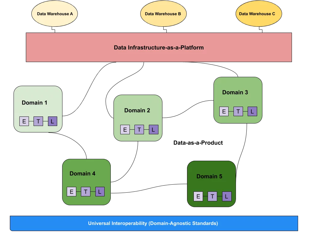 What is a data mesh--and how not to mesh it up
 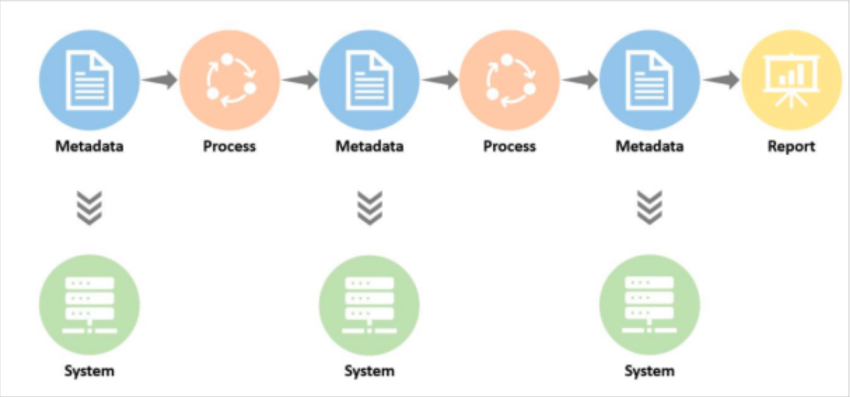 The ULTIMATE Guide To Data Lineage
 New Feature Recap: PowerBI Integration, Delta Lake Lineage, and Data Reliability Dashboard

Michael Segner
Michael writes about data engineering, data quality, and data teams.
As the creator of the data observability category, we’ve long recognized the challenges with data quality, and have been fortunate enough to receive direct feedback from our customers on how to improve and grow our product to meet the demands of modern data teams.
We’re excited to share the results of that feedback with four key product innovations that we shipped last quarter:
- Compatibility with your core modern data stack via new PowerBI and Databricks lineage
- Improving time to resolution for data incidents by utilizing all of our Root Cause Analysis tools, now regrouped into one place
- Getting new users to value faster with consolidated monitor creation flows and monitor customization along each incident
- Tracking and sharing data team impact with our new Data Reliability Dashboard
New integrations: PowerBI and Databricks lineage
End-to-end visibility across data pipelines down to the dashboard level is critical to understanding the blast radius of an incident. We’ve long supported business intelligence tools like Looker, Tableau, and Mode, so it was only a matter of time until we supported Microsoft’s PowerBI.
This provides a Monte Carlo user the ability to understand where reports and dashboards are impacted by any data quality incidents, as well as any planned schema changes, to proactively alert downstream stakeholders to any outages. This builds trust in the team.
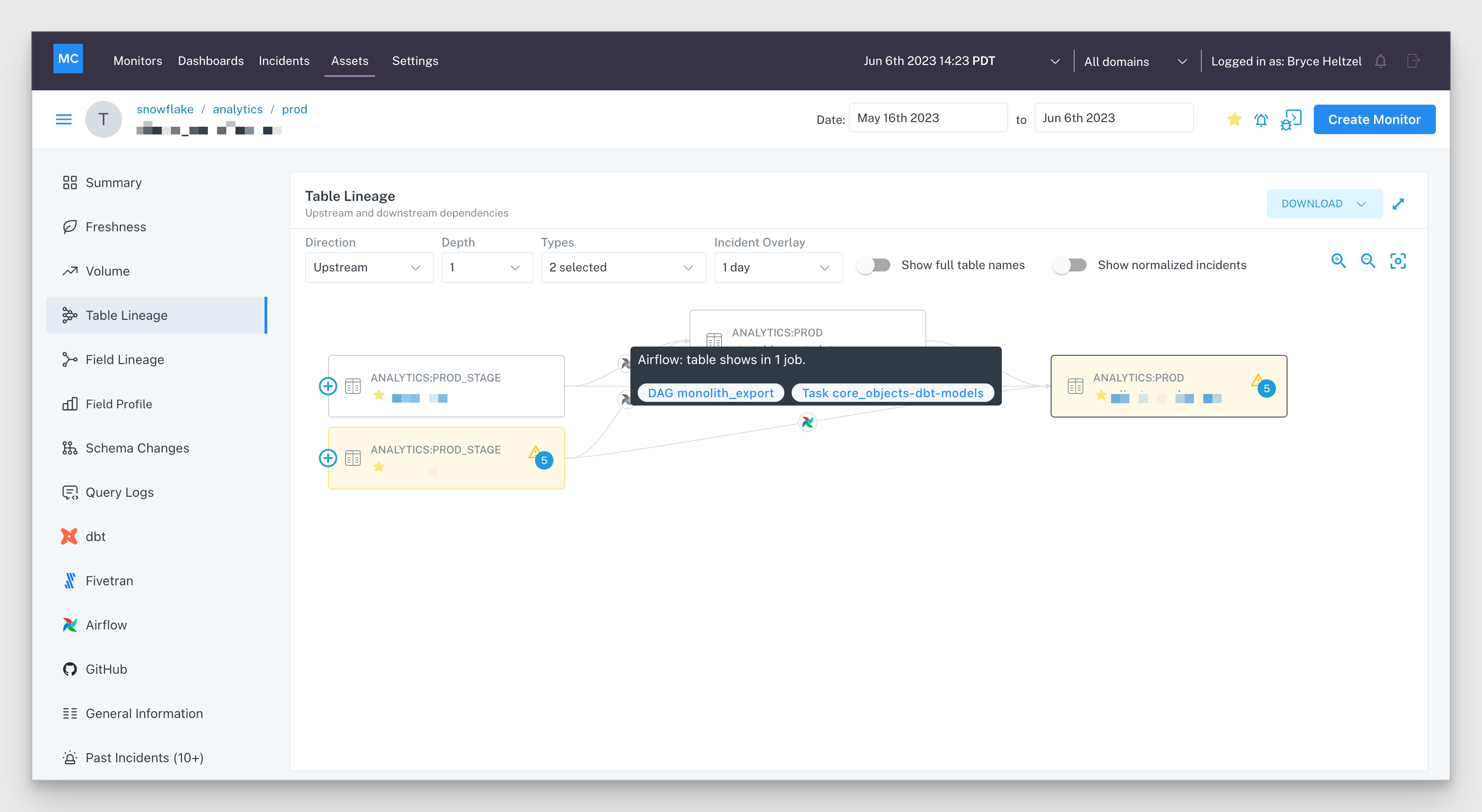
In Q2, we also announced an exciting new integration with Databricks. Today, we are the only data observability platform with the ability to create lineage graphs via Databricks Unity Catalog.
Lineage graphs are automatically created by Monte Carlo using metadata from Unity Catalog to provide an overview of your object relations as well as incidents associated with each object, for the purpose of accelerating your incident resolution timelines. In other words, you can now trace how data flows up and downstream across your data lake similar to how we map table dependencies in data warehouse environments.
This eliminates the need for manual testing at each object in your data lakehouse, moving upstream through referenced objects in your queries, to identify where the source issue lies.

Improving time to resolution
Time to resolution is a critical component of the data downtime equation [number of incidents x (time to resolution + time to detection)].
However, most data teams waste precious engineering hours trying to determine and fix the root cause of their data issues. Our survey with Wakefield Research revealed the average time to resolution was a staggering 9 hours.
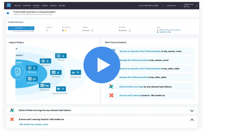
Our latest resolution features aim to radically change that equation. In addition to the lineage graphs mentioned above, we’ve also transformed our Incident IQ page to put all the incident troubleshooting tools you need in one place.
Now, powerful features like field-level and table-level lineage, queries associated with the time of incident, any dbt errors, and the ability to sample anomalous rows can be easily found as tabs on the left side of each incident.
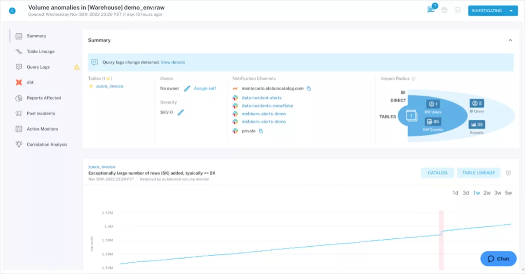
To streamline your teams’ workflows, we’ve also surfaced user activity, such as monitor configurations or comments from past incidents, into each incident, on the top left side of each screen. Now Monte Carlo users can quickly reference past behavior to understand how to prevent incidents from recurring.
Accelerating user onboarding
We understand ease of use remains top of mind as you continue to expand your usage of Monte Carlo. Whether you are providing access to the business stakeholders, expanding across your data engineering teams, or simply focusing on monitoring more key tables, we want our platform to be as intuitive to use as possible.
To that end, we’ve improved our Field Health monitor creation workflow, for your team to more easily track 20+ metrics across your most critical tables, to ensure that key aspects of data quality are monitored for high quality insights.
We’ve also added the ability to toggle sensitivity for automated Freshness and Volume monitors. This enables your team to customize monitors to better reflect any expected anomalies.
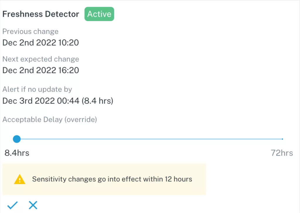
These configurable areas of Monte Carlo were created so that your team can focus on your most critical assets and ensure reliability across your custom business logic.
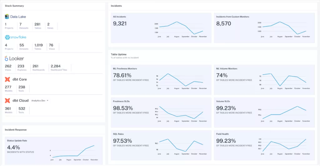
Out-of-the-box visibility into team SLAs
Earlier this week, we announced the launch of the Data Reliability Dashboard, which began rolling out to a select number of customers starting from last quarter. You can find an in depth overview through the link above, but to summarize with that dashboard you’re able to:
- See the total number of incidents that you have, along with the number of objects covered from warehouse to BI tools, to provide context on your general data health.
- Understand table uptime percentage, split by data quality metrics, such as Freshness or Volume. The dashboard also indicates overall data quality as well as areas of opportunity.
- Show your team’s response times to incidents, both for the initial response, as well as the final time to resolution. Now you can report on your decreasing time to resolution as you continue to leverage Monte Carlo.
If you’re interested in learning more about any of these new features and how you can implement them while setting up your Monte Carlo platform, please reach out below!
Our promise: we will show you the product.
Read more posts.