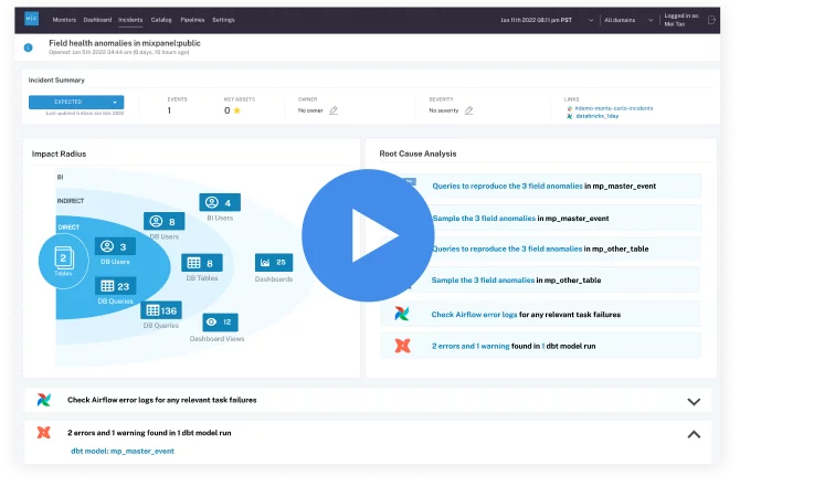
 Product demo.
 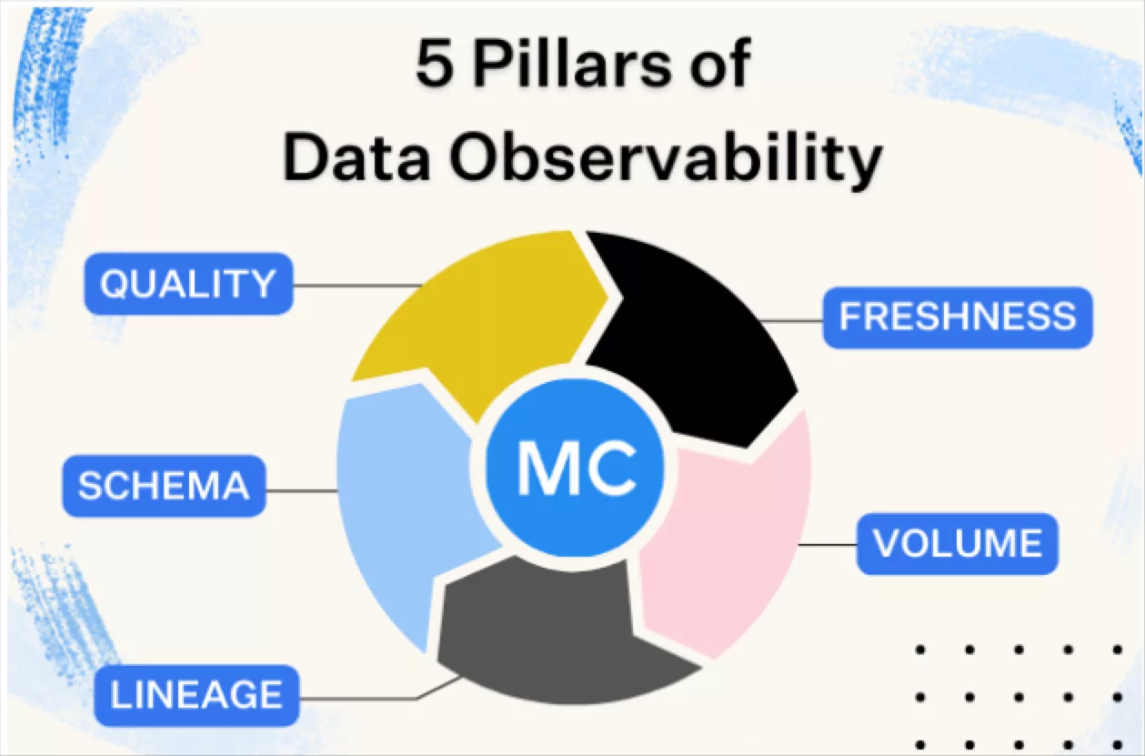 What is data observability?
 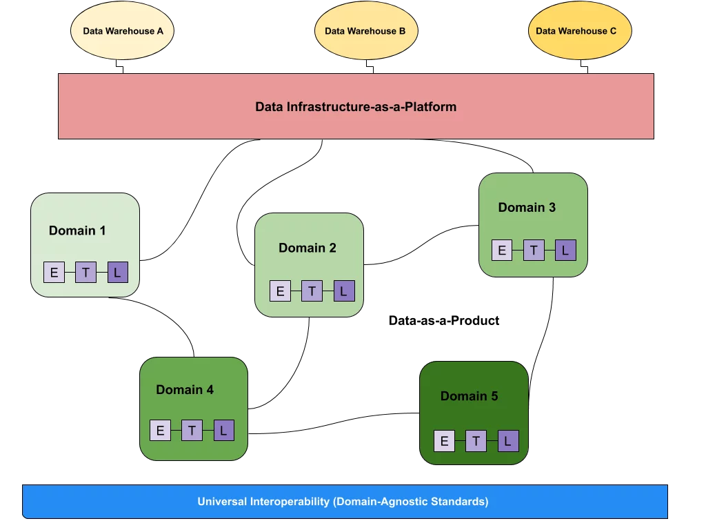 What is a data mesh--and how not to mesh it up
 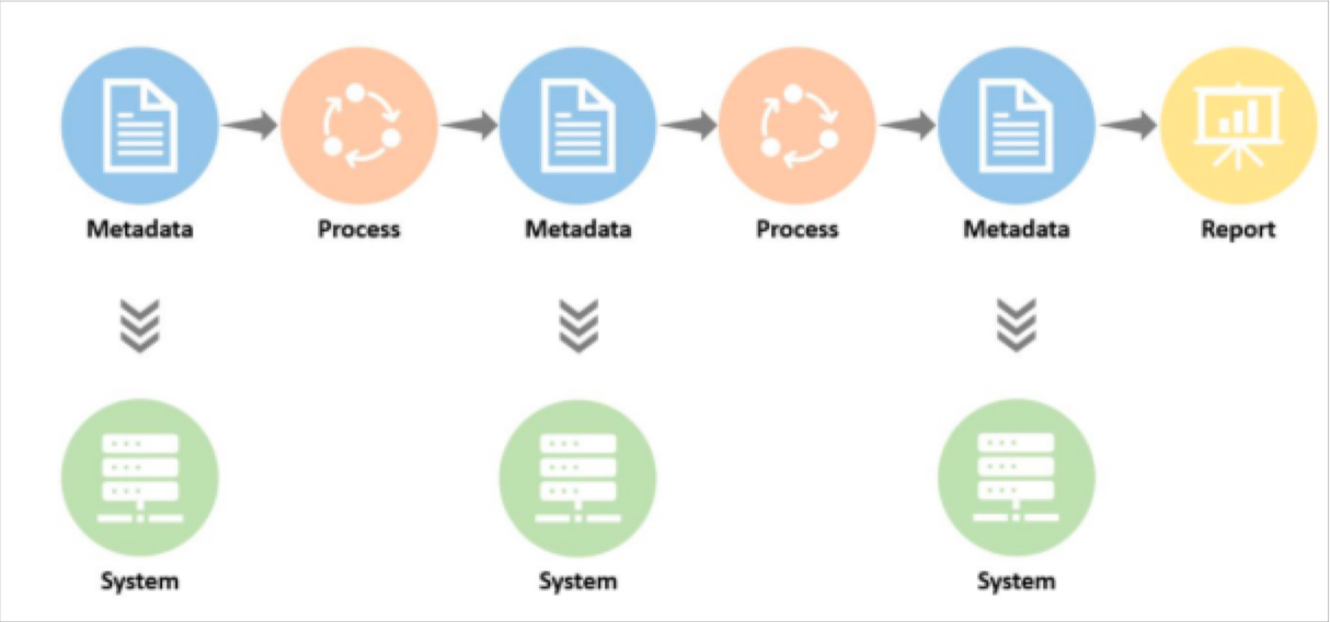 The ULTIMATE Guide To Data Lineage
 How JetBlue Used Data Observability To Help Improve Internal “Data NPS” By 16 Points Year Over Year


Michael Segner
Michael writes about data engineering, data quality, and data teams.
This case study is based on information shared in recent Snowflake webinars and Summit presentations.
With over 1,000 flights per day servicing over 100 network destinations, JetBlue needs to ensure the data informing its operations and business is accurate, on-time, and reliable. This need became even more acute following the airline’s migration from an on-premise database to Snowflake.

“Onboarding Snowflake removed traditional bottlenecks on our team’s capacity, so we started to integrate more data sets into our ecosystem. With more data sets, there are more people using your data, and that means additional scrutiny,” said Brian Pederson, Manager of Data Products at JetBlue. To quantify the additional scrutiny, Brian shared that the team sent out a general sentiment survey to the data user community within JetBlue, which returned a score on data trust that was a bit lower than we wanted.
The airline’s modern data stack consists of Snowflake, Databricks, Fivetran, dbt, and Tableau. It now supports 3,400 analyst-facing tables and views across the company, totaling 5 petabytes of data. JetBlue leverages Snowflake for most internal reporting and analytics use-cases. The airline uses Databricks for its AI strategy, on which it has “doubled down over the last 6 to 12 months.”

Table of Contents
Monitoring and resolving data quality issues at scale
JetBlue required a data observability platform that could operate effectively at scale. Monte Carlo’s automated monitoring fit the bill.
“The platform spends a few days learning the patterns and cadence, and then right off the bat we get volume, freshness, [and schema] alerts across all the tables in Snowflake without us lifting a finger,” Brian said. “So, that 100% coverage we get out of the box is really, really critical… if you’re not actually loading data into your warehouse consistently, nobody will trust it.”
Brian also appreciated Monte Carlo’s other monitors that check the data itself, including:
- SQL: “You essentially just run a SQL statement. Think of this as unit test functionality. An engineer, or a QA tester can write their unit tests for a particular data asset they are deploying, and then it can be run on a schedule. This allows for the test to become a constant check against that table to make sure there’s no problems.”
- Dimension tracking: “This is for your low cardinality columns. It monitors the distribution of values and is really useful. At JetBlue, we use dimension tracking to monitor the health of the data attributes we would expect to see in our business process. This helps us monitor the health of our upstream systems, and in some cases, helps us identify issues with third party data pipelines that we consume.”
- Field health monitors: “To set up field health monitors, you pick a few fields in a table, or all the fields on a table, that you care most about. Then, Monte Carlo will run several metrics and statistics on top of those fields, and alert you when there is an anomaly. One interesting use case is that we use field health monitors to help alert us to drift in our data science models. Monte Carlo monitors fields that measure drift and alerts us to when there is a significant change.”
Monte Carlo also provides critical operational context for data quality alerts, so the JetBlue data team can make informed incident triage and resolution decisions. This includes automatically updated data lineage and key asset scores, as well as the ability to document pipeline ownership.
“When Monte Carlo identifies an incident, it shows you enough metadata so that you’re able to understand what’s being impacted down the line, including how many people are potentially being impacted by the issuer,” Brian said.
“You can proactively receive notifications. It gets [our data engineering team] out of the business of emailing users to let them know that there’s a problem with a table. Monte Carlo [alerts] give that to us automatically, so the analyst that’s using a table will know there’s a problem and we can focus on resolving it.”
Operationalizing data observability
From the start, JetBlue placed an emphasis on integrating data observability into its data engineering workflows.
“An observability product without an operational process to back it is like having a phone line for 911 without any operators to receive the calls,” Ashley Van Name, JetBlue’s Senior Manager of Data Engineering, said.
JetBlue uses a simple three step process to optimize its incident management and response:
- Receive an alert
- Review the alert
- Act on the alert
To act on an alert, engineers need to know the next steps to resolve the problem. Engineers need to have an understanding of where in the pipeline the break could be and who they would escalate the issue with, whether that’s an internal contact or a third-party.
JetBlue executes this workflow via a Microsoft Teams channel, where all of its data engineers and data operations engineers subscribe to Monte Carlo alerts. JetBlue’s data operations team has primary responsibility for investigating alerts and resolving incidents.
“Before we onboarded Monte Carlo, the data operations team’s primary focus was to just monitor pipeline runs that failed,” Ashley said. “But now, they’ve got this extra level of insight where they are able to say ‘something is wrong with this table’ rather than just ‘something is wrong with this pipeline.’ And, in some cases, we see that the pipeline works fine and everything is healthy, but the data in the table itself is incorrect. Monte Carlo helps us see these issues, which we did not previously have a way to easily visualize.”
JetBlue also boasts one of the highest incident status update percentages, in large part thanks to cross team collaboration and continued diligence from engineering leadership.
“Twice a week, the data operations team goes through all of the incidents that occurred since we last met. We take time to look for trends in incidents over time, and discuss whether any trends deserve further escalations,” Ashley said. “It also gives the operations engineers the opportunity to discuss any challenges or questions they may have regarding a specific incident.”
Earning data trust and proving ROI
JetBlue hasn’t just focused on operationalizing data observability, the airline has also taken steps to measure the success of the initiative and overall ROI.
“We have put a lot of thought into the metrics (or KPIs) that we want to track to ensure we’re getting the most out of Monte Carlo. These metrics help us to measure our ROI on additional observability,” Ashley said.

- Percentage of incidents classified: “Imagine that your data observability platform generates 100 alerts over the course of a month. You want to ensure that you’re labeling each of those incidents with a status, or a classification (expected, investigating, fixed, etc.), so that at any point, you can monitor the incidents that still need to be resolved.”
- Time to resolution: “Is [there an incident] that goes unresolved for a month? Hopefully not. It’s important to monitor the time that it takes for engineers to resolve or mitigate incidents. Tracking your time-to-resolution can be an important KPI for monitoring team performance.”
- Number of incidents overall: “We have several thousands of tables that Monte Carlo is actively monitoring for us, and depending on the number of incidents, we can tell overall where we stand in terms of the health of our data.”
- Number of incidents per data set: “If you’re just tracking the total number of incidents across your data platform, you’re not necessarily able to see if there is a particular data set that is causing a problem over time. Tracking incidents per data set will help you to identify opportunities for systematic improvement in pipelines or upstream processes.”
- User engagement: “This one is a bit outside the realm of a [data] observability tool, but we do see value in monitoring user engagement in our data platforms. We believe that user engagement will increase as their trust for data grows.”
- Percentage of healthy data overall: “This is simple to calculate – take the number of data tables that are in an active incident [over a certain period of time] and divide it by the total number of tables being monitored, and subtract that from 100. This helps you understand what percentage of your data tables have been in some kind of incident with respect to your overall data landscape.”
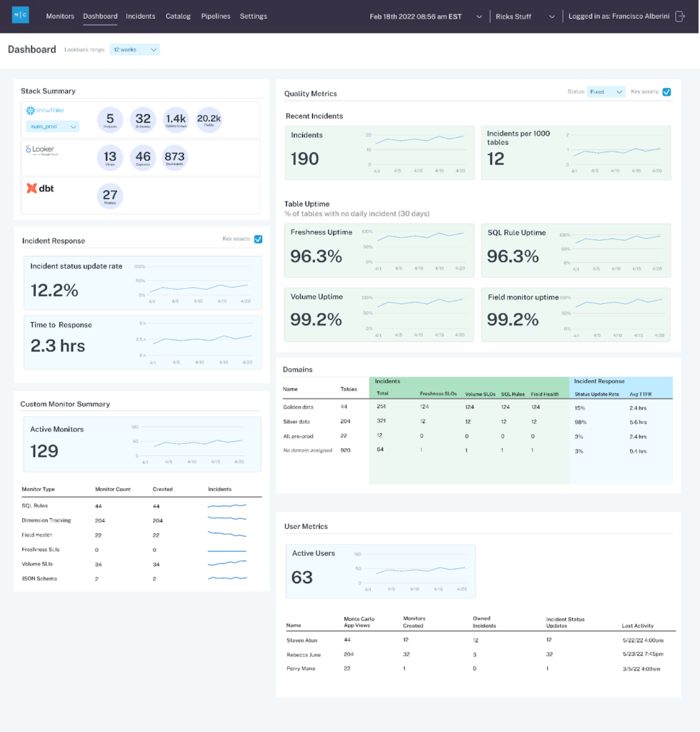
JetBlue is able to track many of its success metrics in the Monte Carlo data reliability dashboard, which can segment performance by domain and even specific data product levels. Its data team also uses Monte Carlo’s Snowflake data share to ingest much of the performance data to populate its own custom dashboards as well.
For JetBlue, it wasn’t just a matter of providing reliable data at scale, but proving it.
“Data trust is a human emotion, which isn’t always entirely rational,” Brian said. “But, if you can give the analysts access to [Monte Carlo] where they can see the health of all the data objects they are using, you can sell them [on the data’s quality].”

To that end, when JetBlue recently surveyed its data consumers more than a year after its Monte Carlo implementation, the airline saw its Data NPS score increase 16 points year over year. Data trust, an on-time arrival.
Our promise: we will show you the product.
Read more posts.