 Product demo.
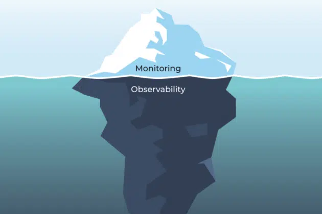
 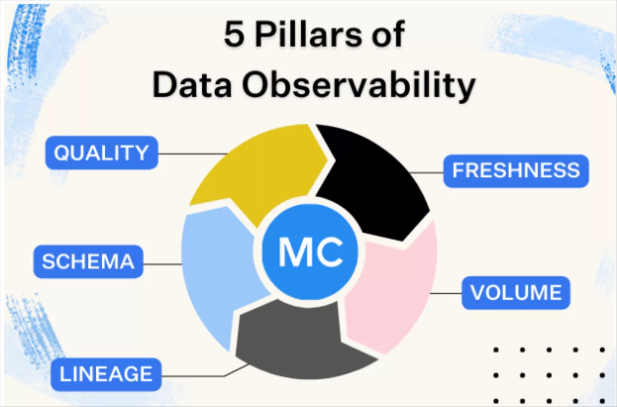 What is data observability?
  What is a data mesh--and how not to mesh it up
  The ULTIMATE Guide To Data Lineage
 Announcing Monte Carlo’s Data Reliability Dashboard, a Better Way Understand the Health of Your Data

Jon So
Head of Product Marketing at Monte Carlo.
While data teams can agree that data quality is important, it can be incredibly difficult to quantify, let alone communicate to the rest of the business.
What if there was a way to tell your analysts that their critical data set wasn’t being monitored? Or that their financial dashboards were plagued by weekly freshness issues? How about a means of tracking – and alerting – on outages as a function of uptime and downtime?
Bad data costs companies a tremendous amount of money (impacting over 26% of their revenue, according to a recent survey by Wakefield Research), as well as engineering hours, with data engineers spending upwards of 40 percent of their time – or 120 hours per week – firefighting data quality issues.
And while we’ve written case studies about how our customers have leveraged end-to-end data observability to achieve great outcomes, from Prefect saving 20 hours per week to Resident reducing data issues by 90%, and many more, there hasn’t been a consistent way to understand and communicate data reliability – until now.
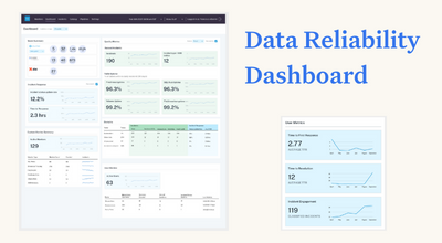
Today, I’m excited to announce Monte Carlo’s Data Reliability Dashboard, which will be available to all customers in Q4 2022.
To better align data teams and their business stakeholders, our Data Reliability Dashboard provides a bird’s eye view of data reliability KPIs and other metrics used to track overall data health. Powered by Patch, a zero-config backend for building data apps and analytics dashboards, our Data Reliability Dashboard is the latest in a series of improvements Monte Carlo has made to help customers drive data reliability and eliminate data downtime, including Circuit Breakers, a new way to automatically stop broken data pipelines, Insights, a functionality that offers operational analytics in the health of your data platform, and native integrations with dbt, Databricks, and Airflow.
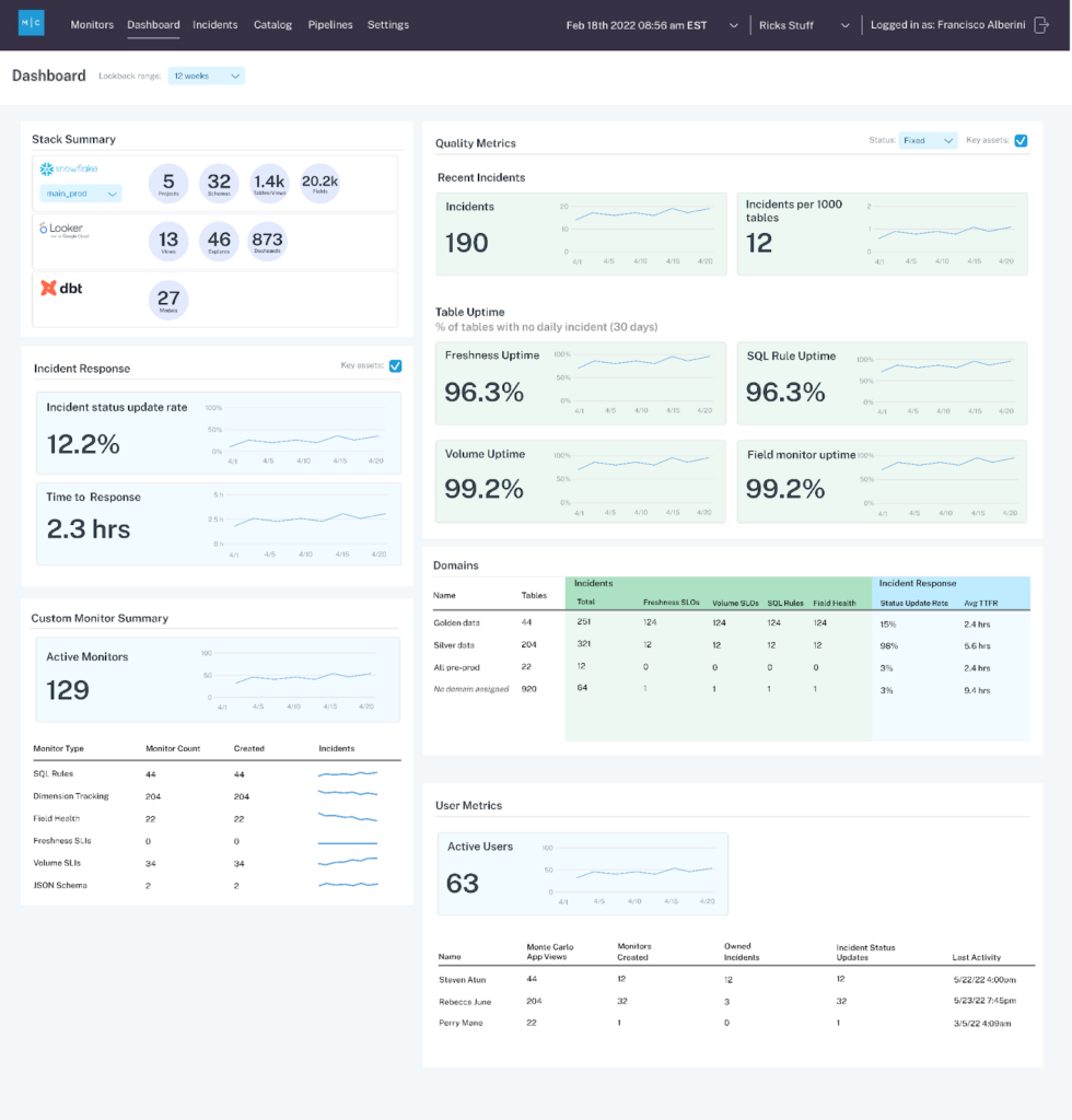
The Data Reliability Dashboard will focus on three main areas that will help leaders better understand the data quality efforts that are happening in their organization:
- Stack Coverage: An overall view of the extent to which their stack is covered by our data observability platform This will help ensure operational best practices are adopted.
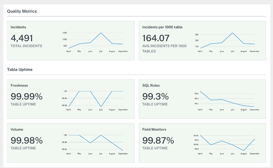
- Data Quality Metrics: Data reliability KPIs around the 5 pillars of data observability, which helps observe trends and validate progress as reliability investments are made.
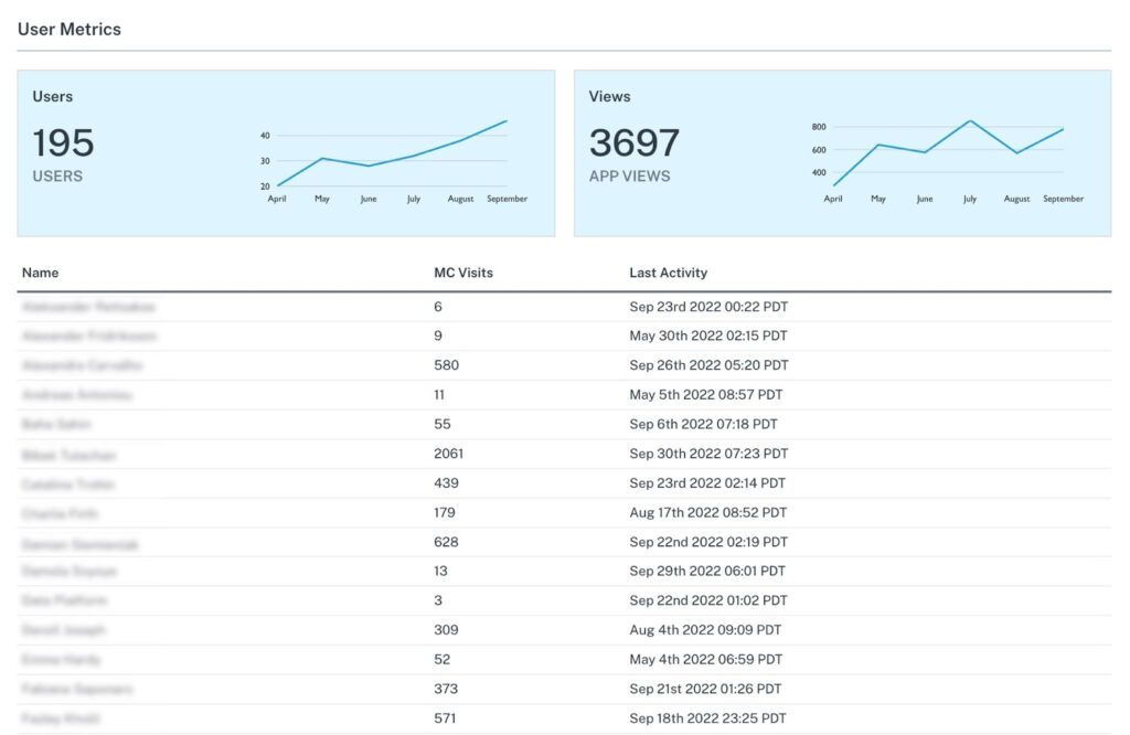
- Incident Metrics and Usage: Measures the time to detection and time to resolution of data incidents, as well as user engagement metrics with said incidents. This allows teams to measure and improve the quality of their incident response operations, thus minimizing data downtime and optimizing data trust.
The team at Monte Carlo also announced two other new capabilities that we’re excited about, including:
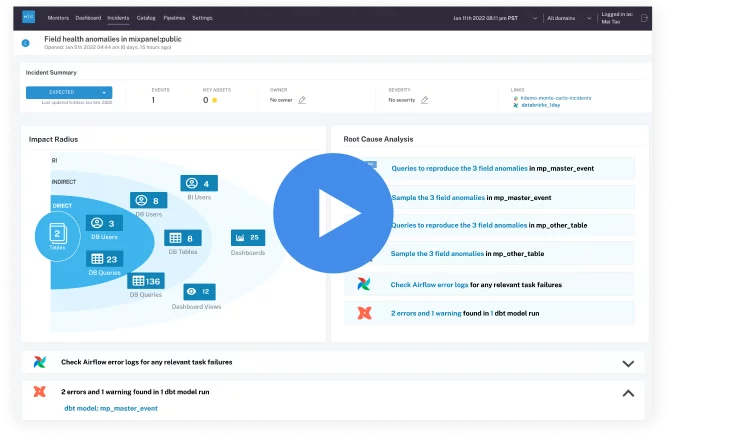
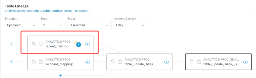
Visual Incident Resolution: Data engineers can now use an interactive map of their data lineage to diagnose and troubleshoot data breakages. With this new release, Monte Carlo places freshness, volume, dbt errors, query logs, and other critical troubleshooting data in a unified view of affected tables and their upstream dependencies. This radically accelerates the Incident Resolution process, allowing data engineers to correlate all the factors that might contribute to an incident on a single screen.
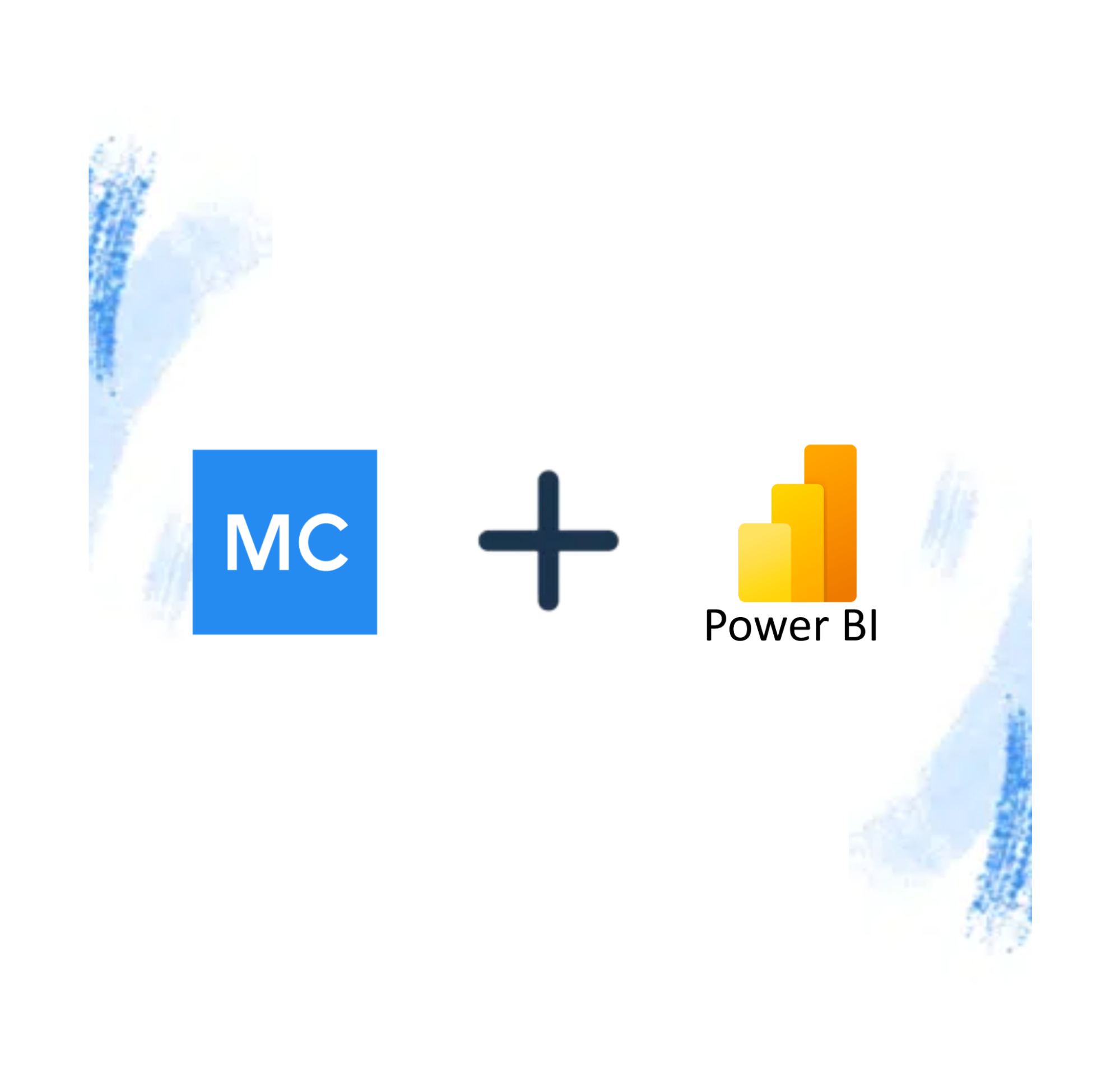
Integration with Power BI: A feature built to address increasing demand from our customers, data engineering teams can now properly triage data incidents that impact Power BI dashboards and users as well as proactively ensure changes to upstream tables and schema are executed safely. As a result, Power BI analysts and business users can confidently utilize dashboards knowing the data is correct.
Pioneering the future of reliable data
As data platforms grow increasingly complex and the need for trustworthy, highly data grows, data engineers and analysts need a central, single source of truth to understand and communicate data health to the rest of the business.
Monte Carlo’s Data Reliability Dashboard gives these teams everything they need to track, measure, and scale data quality initiatives in a single view, empowering organizations to improve testing, observability, and quality coverage over time.
Now, understanding end-to-end data health is as easy as clicking a button. If only fielding ad hoc requests were as easy.
Interested in learning more about our Data Reliability Dashboard? Reach out to Jon and the rest of the Monte Carlo team!
Our promise: we will show you the product.
Read more posts.